My Beef with the iOS 26 Tab Bar
If you're reading this blog post, you are undoubtedly aware of the controversy surrounding Apple's newest design system, a.k.a. Liquid Glass, that was introduced with iOS 26 and Apple's other operating systems.
Most of the criticism fairly centers around overuse of transparency and the lack of text legibility. However, I want to focus on something else here—something that is more nuanced and admittedly pedantic, but still worth discussing: the design of the search tab in iOS 26 tab bars.
Up until iOS 26, tab bars were fixed on the bottom of the screen and spanned the full horizontal space. Now, tab bars are capsule-shaped and inset from the screen edges.
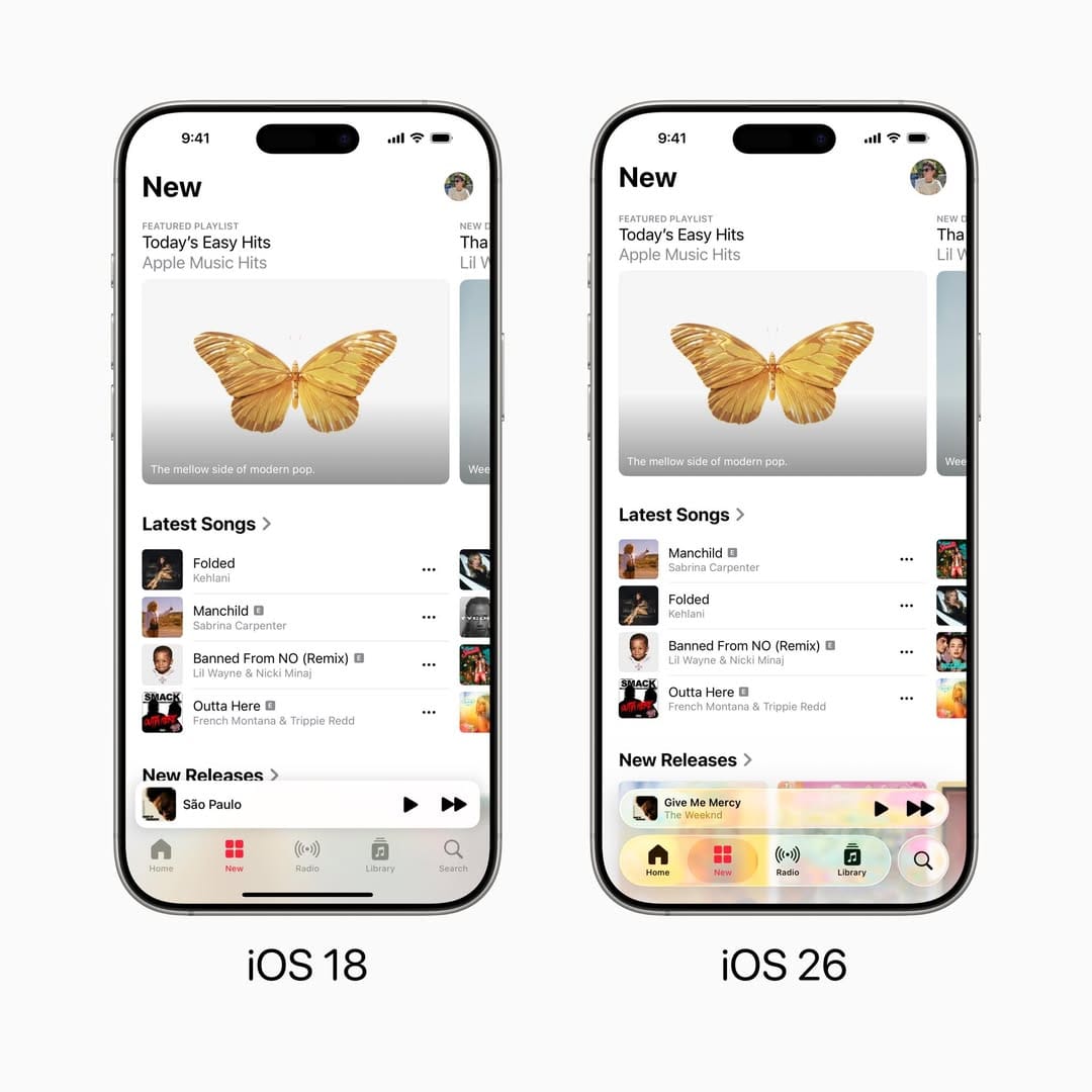
Before, all tabs were treated the same visually. In iOS 26, Apple has made a special case for a certain kind of tab: a "search" tab. These tabs are common in content-focused apps like Apple Music, Apple TV, and the App Store.
Search tabs are separated visually from the rest of the tab bar and have a circular shape. When switching to the search tab, there's a morph animation from the circle to the search field, which is now on the bottom of the screen. The new placement is convenient for reachability, a major selling point of the new design system.
Apple achieved its goal of making search bars reachable. There are some UX quirks I could nitpick (how the tab bar collapses when the search tab is selected, for instance), but the real problem is more fundamental: the search tab doesn't look like a tab. It looks like a button.
One of the fundamental principles of good user interface design is predictability: clearly indicating exactly what will occur upon any sort of interaction before that interaction occurs.
In order for software to be predictable, it needs to offer clear affordances. Affordances can be inspired by the real world, like a glossy button that screams "click me". Affordances can also come from established convention, like blue and purple underlined links in web pages indicating a hyperlink.
iOS has had affordance issues before. iOS 7 controversially made buttons look less button-like by removing the background and outline, and instead were indicated simply by colored text. While this offered a minimal aesthetic, it was certainly a weaker affordance than the pre-iOS 7 button style.
The new search tab is problematic because it looks no different than any other button in the new design language. It has the same shape, color, and overall aesthetic. The only clue that it is a tab is its location adjacent to other tabs. This is not a strong enough differentiator, and fails to afford itself as a tab.
The Repercussions
The search tab's failure to resemble what it is, a tab, is causing real-world confusion about what developers should do.
Since the search tab looks like a button, developers and designers are treating it like one. Specifically, they're using it (or emulating it) for their app's primary action: the single most important action in an app, like composing a message or adding a new entry.
This need isn't new. For over a decade, apps have needed a way to place a reachable primary action button alongside a tab bar. Phones got bigger, thumbs didn't, and some actions—drafting an email, composing a tweet, adding a task—are what users came to do. That action deserves the most reachable spot on screen.
Apps have solved this in two ways for over a decade: embedding buttons in the tab bar (like Instagram's 2011 camera button) or floating them above it (formalized by Google in Material Design 2014). Apple has never officially supported either. The Apple Human Interface Guidelines says tabs are for navigation, not actions. Yet these patterns are near-universal in successful iOS apps.
Now, with the search tab looking indistinguishable from a button, many are abandoning these workarounds entirely and hijacking (or recreating) the search tab for their primary action.
Here are some examples I've found (two of which, Craft and Structured, are Editor's Choice apps):
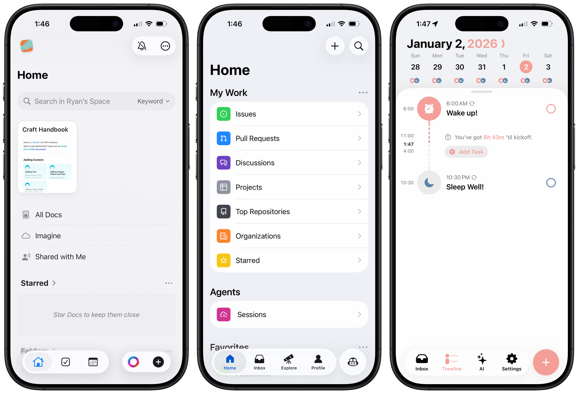
Craft. They've recreated the native tab bar. You can tell because it lacks the glassy blob effect when dragging on the tabs. That effect comes from a private API unavailable to third-party developers.
GitHub. They're using the native tab bar but have repurposed the search tab to start a new Copilot chat. It functions like some sort of Frankenstein of a tab and a modal overlay sheet: tapping it switches tabs, as normal, but the tab bar disappears and instead there's a cancel button in the top toolbar to return you to the previous tab. In my opinion, this is a violation of the Apple guideline to not use tabs to provide actions.
Structured. They've done a good job emulating the tab bar's layout, but again, no glassy effect. It's a custom implementation with a primary action button where the search tab would be.
Designers posting mockups on Threads and X are doing the same, placing action buttons in the search tab position as if it were the obvious, intended use.
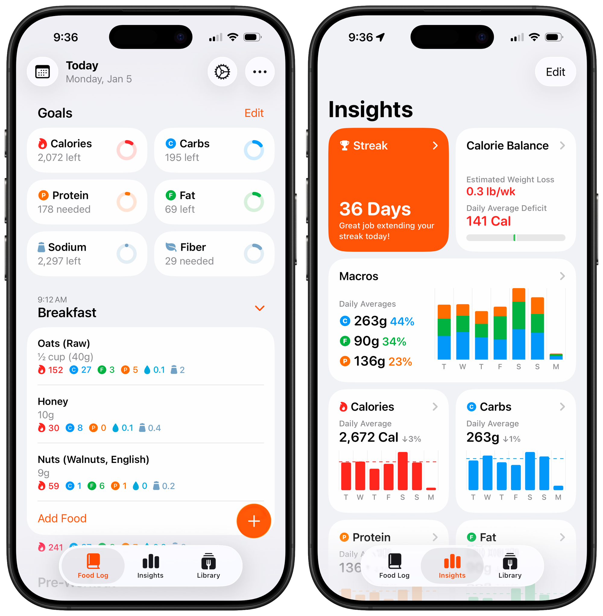
I'm personally feeling the impact of this confusion as the developer of Foodnoms, a food logging app. Since iOS 26 launched, I've received numerous support requests asking why the app's "+" button isn't beside the other tabs, "like other apps have it." I never received these requests before iOS 26.
When following Apple's guidelines makes your app look wrong compared to apps that ignore them, something has gone wrong. The search tab is setting an expectation Apple didn't intend: that the circular element on the tab bar is a button, not a tab.
Apple clearly understands the need for reachable primary actions. Notes, Reminders, and Journal all have them: prominent buttons at the bottom of the screen for the app's most important action. And here's the thing: the compose button in Notes looks almost identical to the search tab. It has the same shape, same position on the right side of a bottom bar. Apple is training users to expect a primary action button in that spot. But when an app has a tab bar, that spot becomes a tab instead. It's no wonder users are confused.
No Good Options
Here are my options as a developer of a tab-based app with a primary action:
I could emulate the tab bar. Rebuild it myself with custom controls, add my primary action button beside the tabs, and accept that I lose the native tab change and drag-to-select glossy glass treatment.
I could hijack the search tab. Customize the icon, intercept the tap, and present an overlay sheet instead of switching tabs. Some apps are already doing this. But it explicitly violates the Human Interface Guidelines, and I'm not comfortable building core UX on undocumented behavior that could subtly break with any OS update.
I could move the button elsewhere. Put it in the top navigation bar, or bury it inside content views. But this is a non-starter. That button is the most important action in my app. It must be reachable.
Or I could keep using a floating action button. This is what I've chosen, for now. It's the least objectionable option. But it's not officially recommended, it's never felt like a first-class citizen on iOS, and with the new centered tab bar layout in iOS 26, it sits awkwardly above empty space when you have three tabs.
Some users have suggested making logging its own tab. But tabs are for navigating between sections of an app. Logging a meal is an action, not a destination. It belongs in an overlay sheet, not a tab.
None of these are good options. And the fact that I have to choose between them at all is the problem.
Apple can set guidelines, but it can't ignore a pattern that's been industry-standard for over a decade. When this many apps need something the platform doesn't provide, the answer isn't "don't do that"; it's to provide it.
Meanwhile, the search tab's button-like appearance is training users to expect a primary action button in that position. Apps are delivering on that expectation, whether by hijacking the search tab or emulating the tab bar entirely. Users see those apps, then open mine, and wonder why it looks wrong. The line between navigation and action is blurring—and with it, the predictability that makes iOS feel coherent.
I don't want to hack around the system. I don't want to confuse users by mixing paradigms. I want to be a good platform citizen. But Apple hasn't given developers like me a way to do that.
Until there's an officially supported pattern for apps that need both a tab bar and a reachable primary action button, the ecosystem will stay inconsistent, developers will keep improvising, and users will keep expecting something that Apple's own guidelines say we shouldn't provide.