A Paywall Optimization Success Story
Yesterday, I concluded a two-week experiment on the Foodnoms onboarding paywall screen. The experiment was a success. In the spirit of building in public, I want to share the motivation, process, and results of this experiment.
Background
Foodnoms is a nutrition tracking app that I started five years ago as a burnout recovery project, following four years at a high-intensity startup. Foodnoms had a successful launch, but it wasn't an overnight success. It's been a constant grind to continue to grow the app, mostly all by myself.
The app is freemium with a subscription offering. I've always been quite generous with the free plan, as it differentiates the app from other alternatives, even MyFitnessPal and Lose It!, both of which are now putting critical features behind their paywalls. This freemium strategy has been successful in creating word-of-mouth and helping to grow the food database, which was especially lacking in early years and continues to be a key focus.
The tradeoff here is that revenue growth has been slow, albeit always up and to the right. Since I started working on Foodnoms full-time again a year and a half ago, I've renewed my focus on growth and monetization. Of which, I have focused on four aspects:
- Moving some features behind the paywall.
- Building new paid-only features.
- Increasing discovery and downloads (e.g. ASO, Apple Search Ads).
- Paywall optimization – the focus of this blog post.
Leading up to this project, I had two wins related specifically to paywall optimization. I redesigned the paywall a little over a year ago, resulting in a 1% absolute increase in conversions from first app open to paid.
Then last December, I fixed a bug where the paywall didn’t mention the trial and incorrectly reported trial ineligibility on first app open. This bug fix significantly boosted the rate of new users starting a trial.
At the start of 2024, I was working with Steve Young from App Masters, who conducted an app audit on Foodnoms, including critical feedback about my paywall and onboarding flow. At the time, I was busy with other projects, so I couldn’t act on the feedback immediately.
I was finally able to find some time earlier this month, and it took about three weeks end-to-end to design, build, launch the experiment, and collect enough data.
Design
Steve Young suggested a few paywall designs to consider. The one that interested me the most was very different from the existing one, which focused mostly on the premium features.
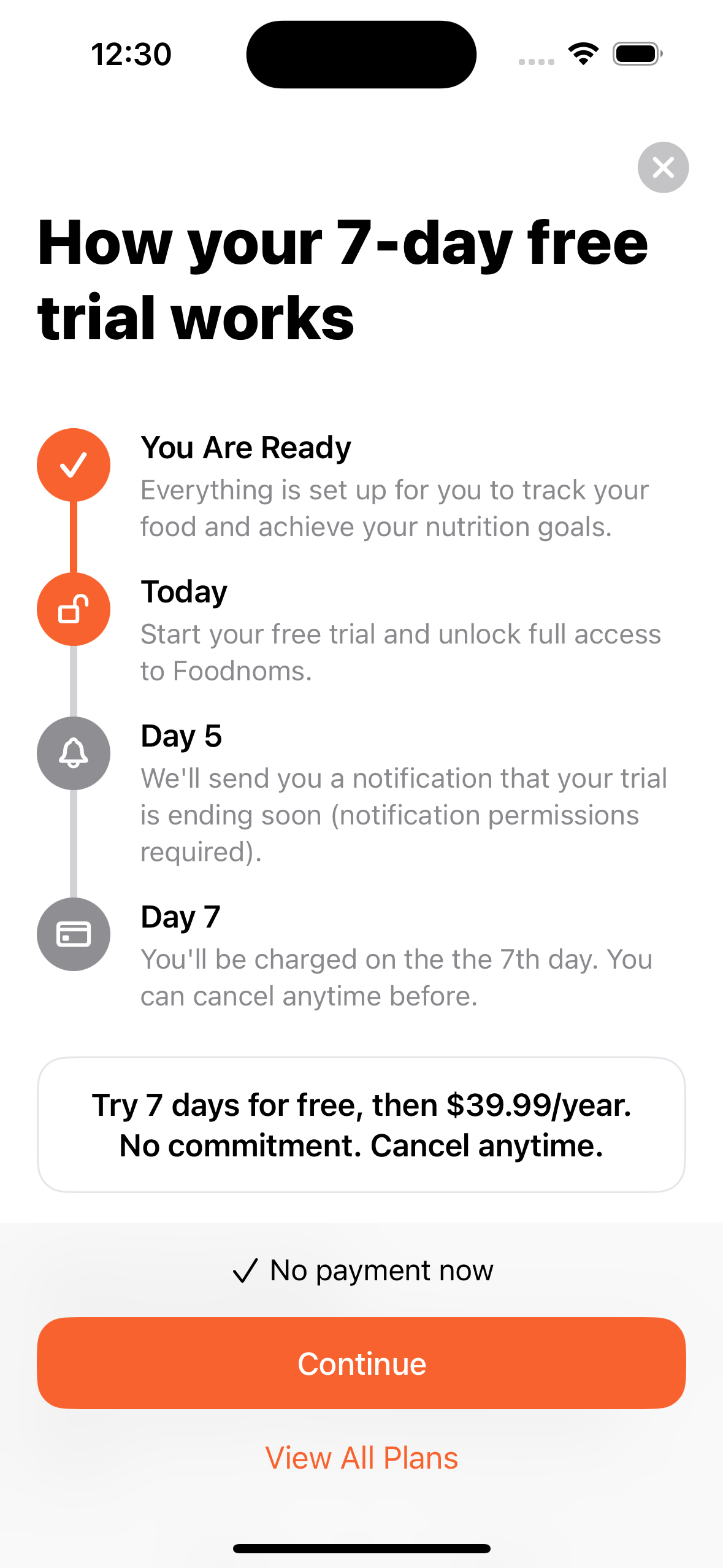
I don't know if this paywall design has an industry standard name, but I call it the "trial timeline" design. (Update: I have since learned it is commonly referred to as the "Blinkist" paywall.) Here are some examples I pulled from paywallscreens.com:
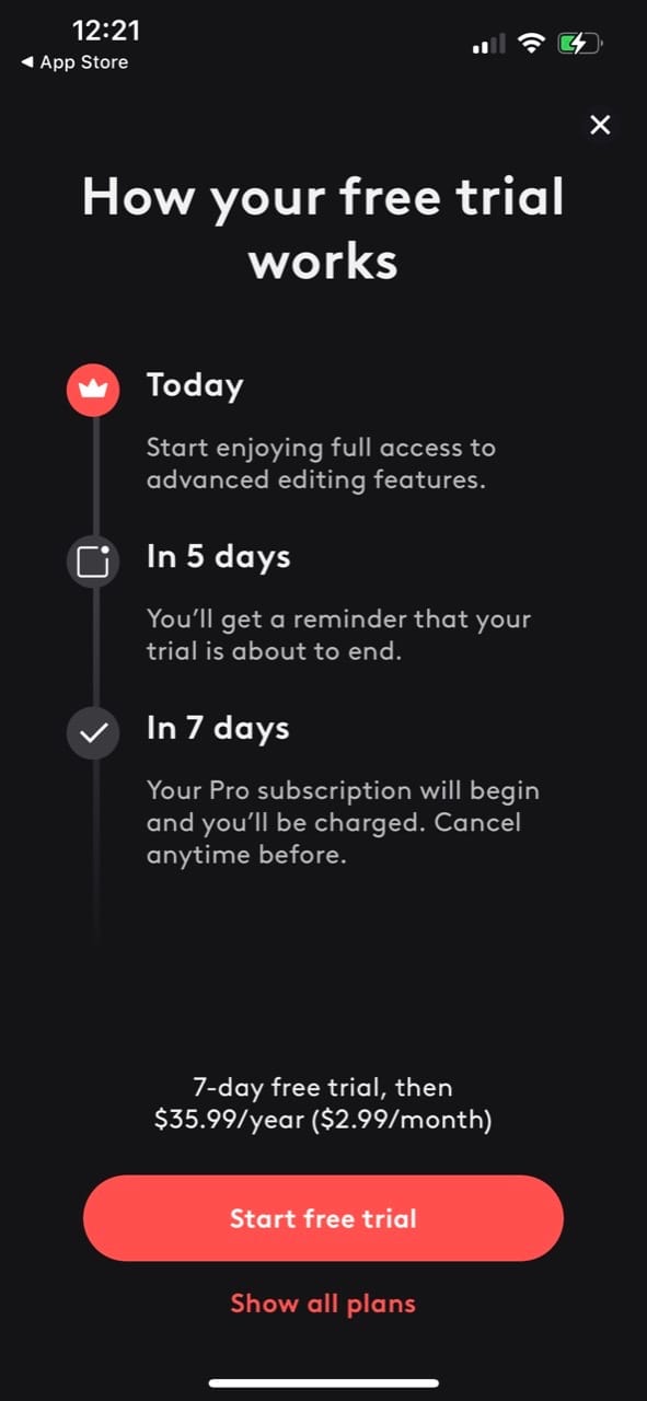
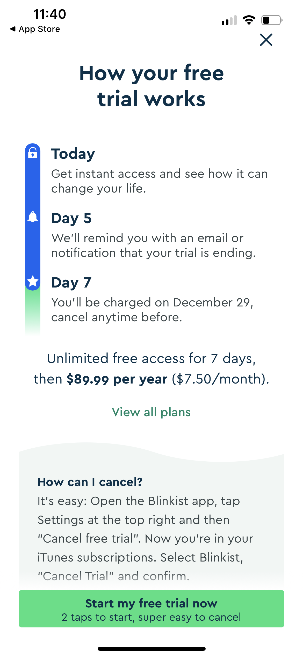
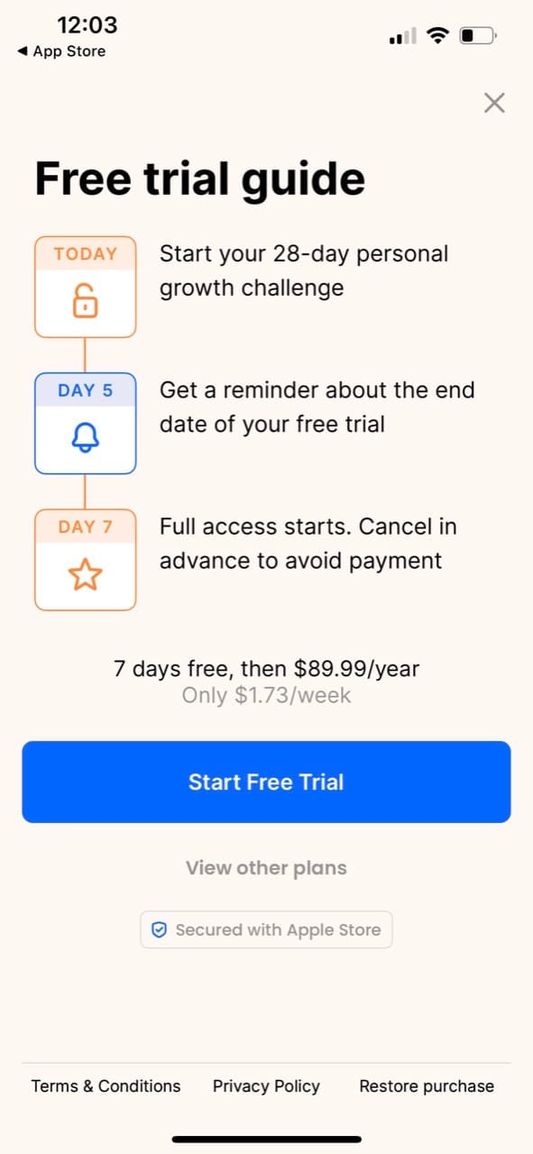
I’ve seen this design in a few apps, and it fascinated me because it’s very different from (what I consider is) a traditional app paywall.
This paywall must be successful for audiences where a primary hesitation to signing up for a free trial is the fear of forgetting about it. The design confronts that fear head-on and aims to eliminate it by promising a notification. It also clearly explains how to cancel the trial right there on the paywall.
The other aspect of this design that is interesting is that it has an entirely different framing. Instead of pitching a set of premium features as an optional add-on bundle, it sets expectations that the trial is the intended, primary path. The focus is on the free trial, not the features.
I sat down with Figma and got to work. I decided to build a high-res mockup first in Figma for this, as it made it easier to focus on the design and copy as opposed to the code.
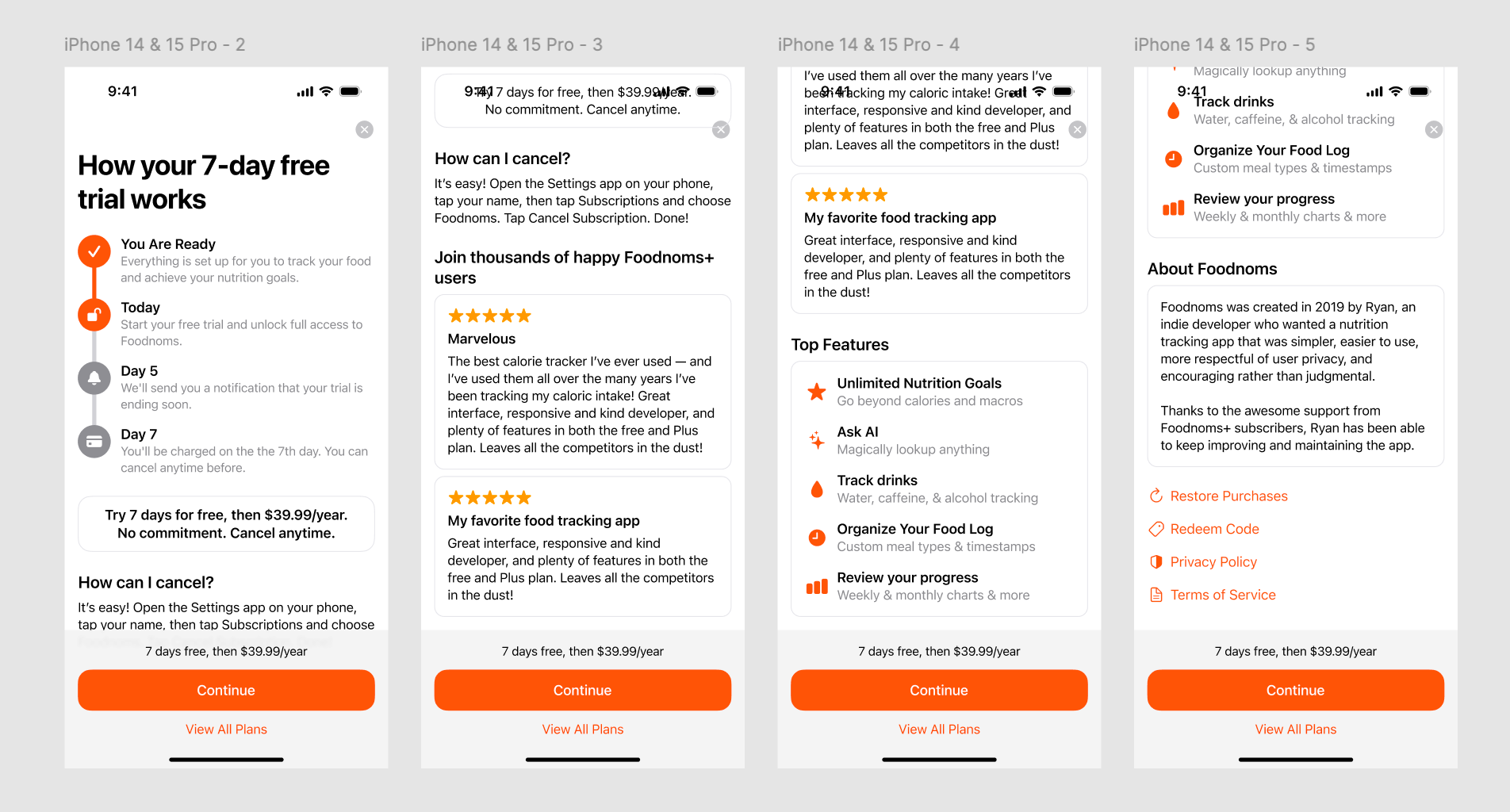
This design discards the fancy header and rotating 3D app icon, which helps it fit better into the onboarding flow.
I sought inspiration from many apps for this screen, including paywalls shared on Superwall's dashboard (I didn't end up using Superwall for this experiment). Some portions of the bottom portion of the paywall were directly influenced by Flighty (whose paywall is absolutely gorgeous by the way).
Implementation
I started by duplicating my existing SwiftUI paywall, then built the conditional logic to determine which paywall to display.
It was really fun translating the Figma design into SwiftUI code. I built it block-by-block, and with each section it felt like a game of "how close can I get to the design in my first try". Since I use the official Apple Figma design kit, it was super easy to reference the dynamic type text styles and system colors that I used in the design. Designing with auto layout in Figma also makes it super easy to translate the design into a bunch of VStacks and HStacks.
Trial Expiration Reminder Notification
The "Day 5" notification is essential to this paywall's design. I knew this would be the biggest technical and QA challenge, because it is imperative that it be implemented correctly. Failing to deliver on this promise would be catastrophic.
I saw that Superwall offers local app notification reminders for trial expiration, as part of their SDK. This gave me confidence that I could implement this myself. I already have a local in-app notification system, so adding one more notification type wasn’t hard at all.
Since users can deny permissions for in-app notifications, I wanted to maximize the likelihood that they would allow system notifications. This means clear communication and handling of all edge cases.
The first step is moving the notifications onboarding step from before the paywall to directly after.
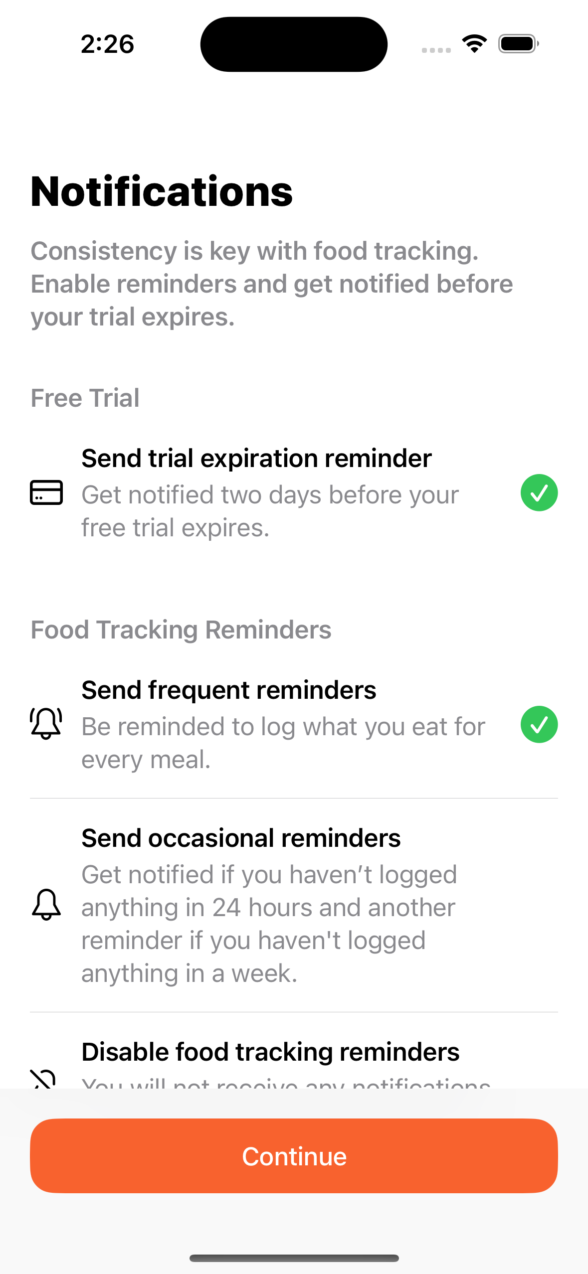
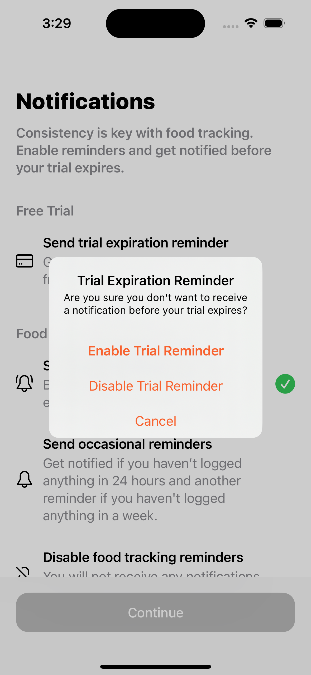
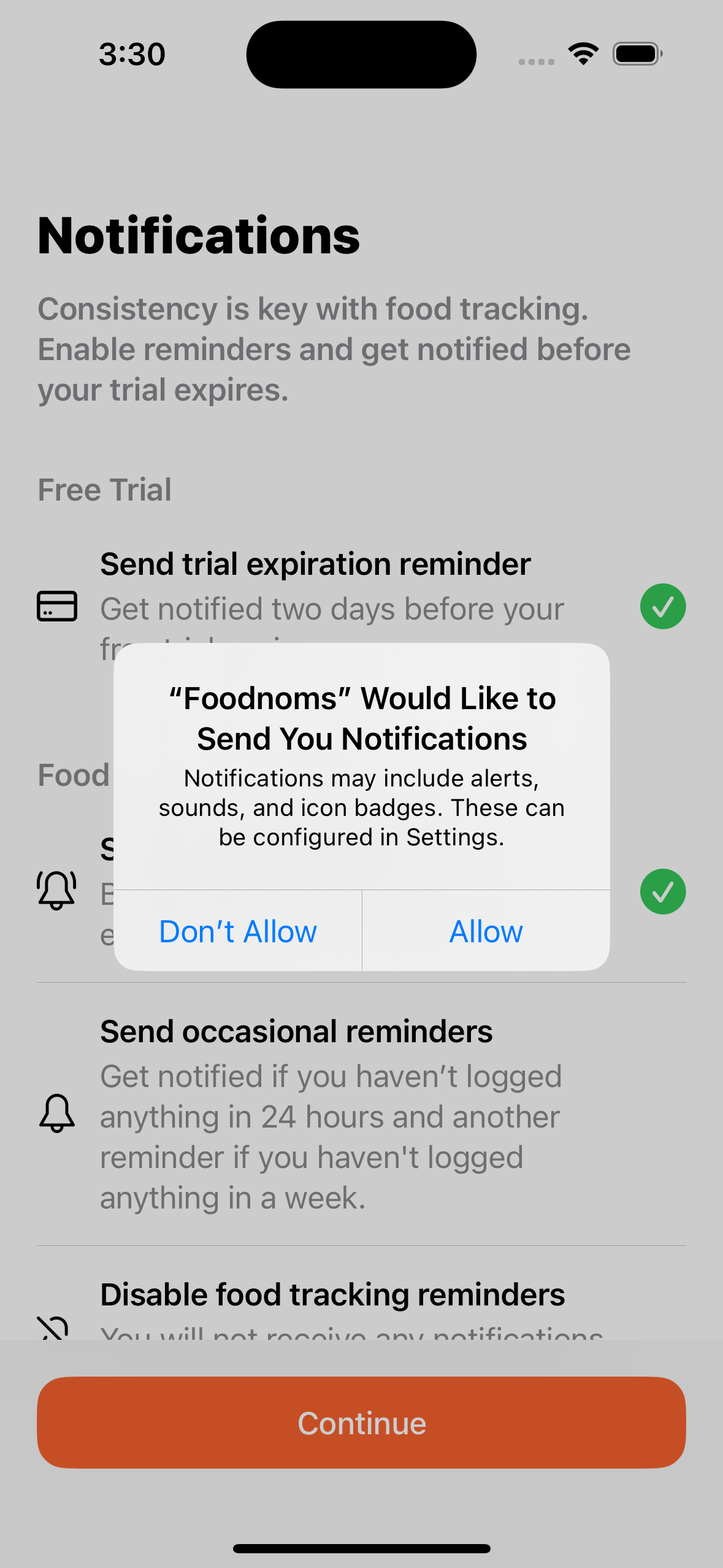
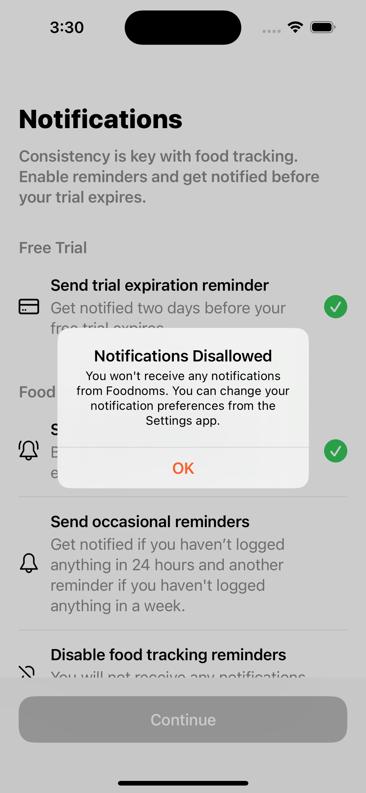
It seemed natural to me to show the trial notification as an option on this step, rather than adding an additional onboarding step. It is enabled by default, with a clear, green checkmark symbol. However, if you disable it, it confirms that you actually want it disabled. And if you disallow notifications at a system level, there's a final alert informing you about this choice.
Split Testing
I used RevenueCat Experiments to power the split test. I created a duplicate offering of the "default" offering, and made no changes to the offering itself. This was just a necessary step to configure the experiment. On the code side, I just needed to check the user’s current offering to see whether they should be shown the new design or the old one. Note: the user also has to be eligible for the trial in order to be shown the new design.
The paywall variation was also tracked in Amplitude so I could monitor early indicators. It only took a few days to reach statistical significance for the conversion funnel from starting the onboarding to starting a free trial, simply because the uplift was so large. I knew at this point that this was likely going to be a winner.
Still, I needed to wait at least a week or two to start to see how things would shake out in terms of trial-to-paid conversion. I expected this metric to fall, given the trial reminder and the huge uplift on the trial start rate. But my hope is that it wouldn't fall so much to offset the lift from new-user-to-trial conversion.
I could have run the experiment for longer to get even more solid numbers, but I have enough confidence that the new paywall is a definite improvement.
Here are the highlights of the results, as reported by RevenueCat:
- Initial conversion rate (percent of users that start a trial or the monthly plan): +58%
- Trial conversion rate (percent of users that converted from the free trial to a paid subscription): -15.9%
- Conversion to paying (percent of users that made a payment): +59.6%
- Realized LTV per customer (revenue divided by number of users): +23.3%
Note: Percentages are relative to the control group during the same time window. These figures will continue to change as users from the experiment cohorts progress through the conversion funnel or churn. Metrics that lag will be more likely to change, and there will be less confidence in the final results.
I'm super happy with these results, which have exceeded my initial expectations.
When the lift is this large, I believe it's quite indicative that the old design, or whatever the control group represents, is quite unoptimized (aka bad). I wouldn't expect this level of improvement for my next onboarding paywall experiment.
The old paywall design is still shown to users outside of the onboarding flow and in the edge case that a new user is not eligible for a free trial. Perhaps my next big opportunity will be to focus on a new paywall for these cases.
Design Comparison
Here are full before/after screenshots, for reference.
Before:
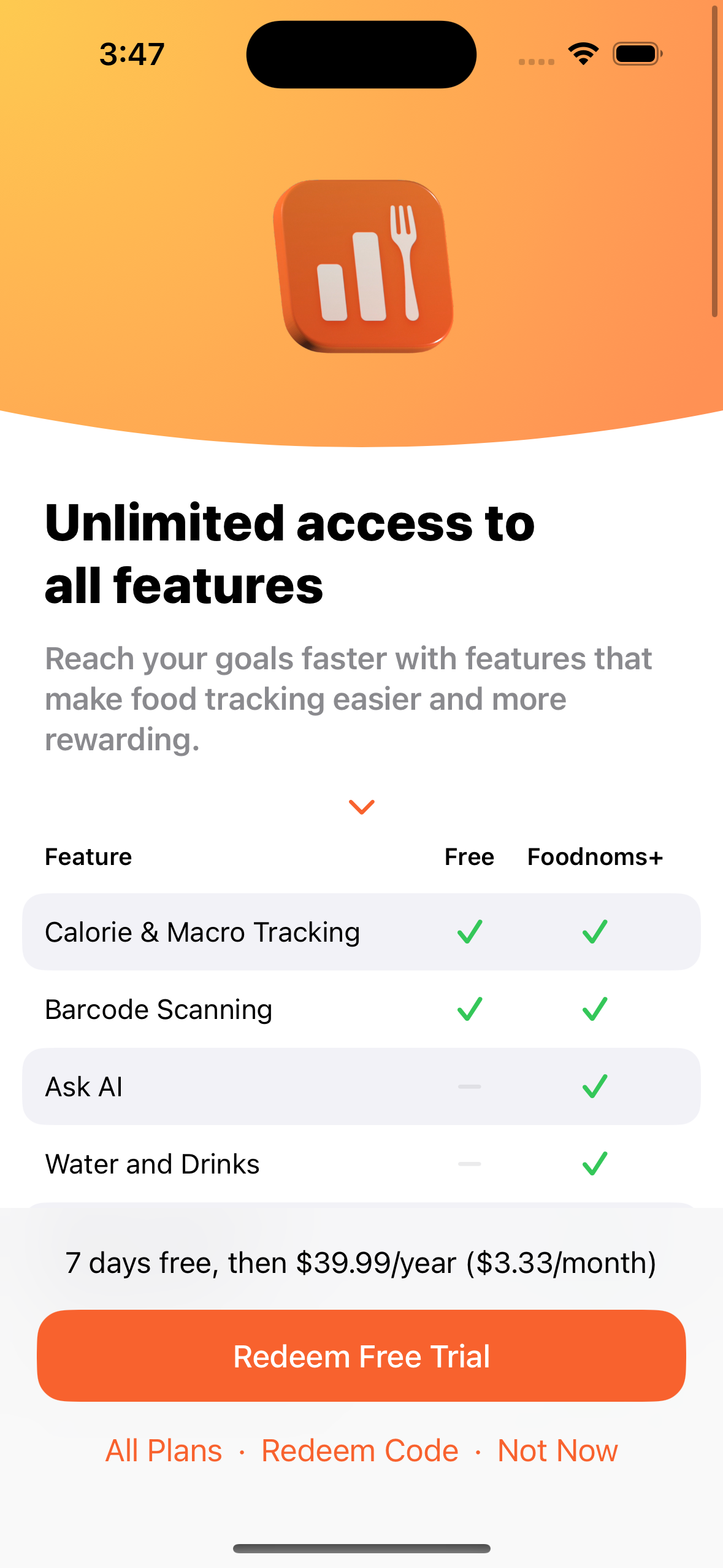
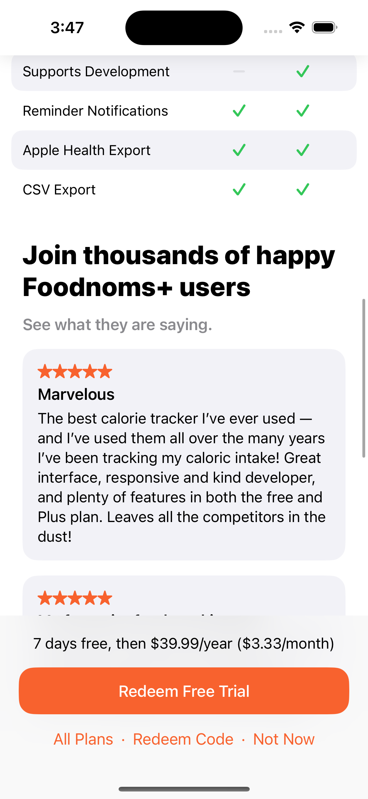
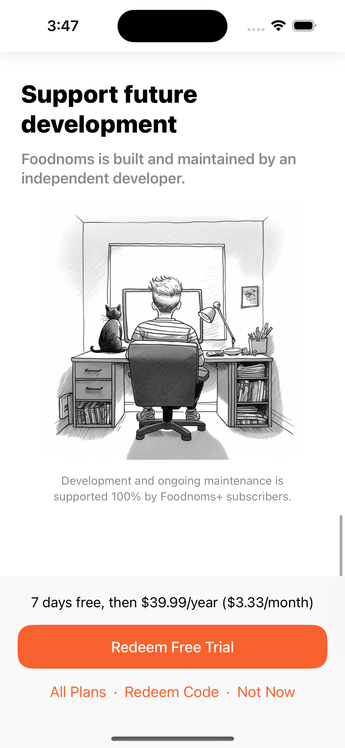
After:
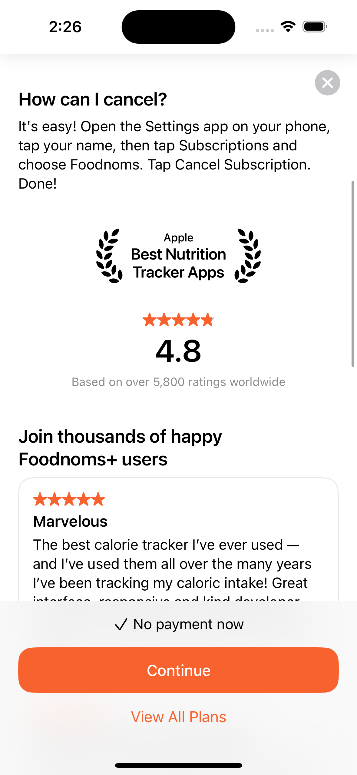
You may notice a few changes between this and the original Figma designs. I decided to include the "Apple: Best Nutrition Tracker Apps" laurel leaves graphic and star rating to add more social proof. I chose the laurel leafs graphic in particular because I learned from an experiment last year that treatment helped increase conversion rate on the App Store page.
User Feedback
It's only a sample size of one, but I was incredibly heartened by this App Store Review that mentioned the trial notification:
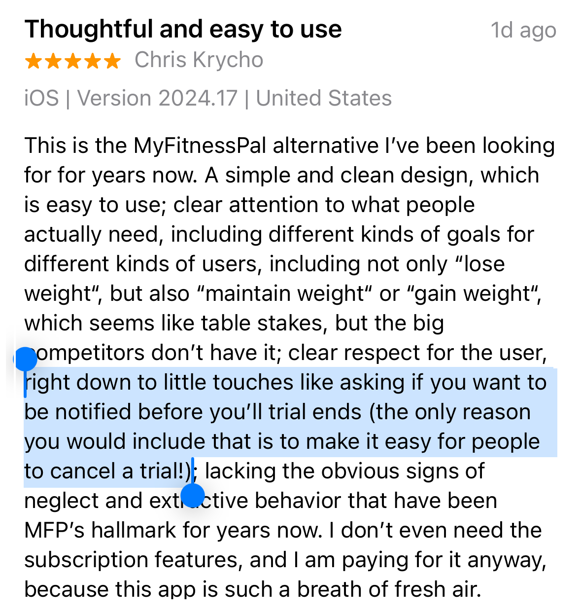
I haven’t received any reports or complaints from anyone about not receiving their trial notification, which is a relief. I'm sure it will happen, and I expect they will have no problem receiving a refund from Apple, but I hope it doesn’t become a trend or growing problem.
So, indie app devs, if you've been looking for a sign or motivation to optimize your paywall, maybe this is it?
Cheers.
– Ryan