Growth Design Retrospective – Driving Users to Sign Into the Community Database
In my previous full-time role, I was a software engineer on a growth team. I loved that the job was fast-paced and allowed me to flex my product and design muscles, in addition to my engineering skills.
The team spent most of its time optimizing funnels by means of A/B tests. One key part of the process we developed as a team was writing up retrospectives for the experiments we ran. I loved writing up these retros; I found it quite enjoyable to pause, dive into the data, synthesize and draw conclusions, pose new questions, and share my learnings with the team.
The ironic thing is, I don't do much growth work with my own product. Part of the reason is I currently lack the infrastructure or tooling. I'm also not in the habit. Another key factor is sample sizes. I'm just starting to get to the point where I could actually run some proper A/B tests, especially at the top of the funnel, if I wanted to.
In the meantime, I'm taking a scrappier approach. I'll ship a major redesign to something and simply compare before/after behaviors for new users between previous versions and the new one. This is less than ideal, but it's certainly good enough for the stage I'm at. Most of my focus these days remains on improvements to the core experience of the app, as well as new marketing efforts and experiments. But when I spot an opportunity, I'll prioritize working on a "growthy" project.
Two versions ago, I shipped a relatively minor change that actually made quite a difference on some key metrics. Given this is a solid, simple case of a successful growth project (although, note that the methodology isn't exactly rigorous), I thought it'd be fun to publicly share a proper retrospective on the "experiment".
Background
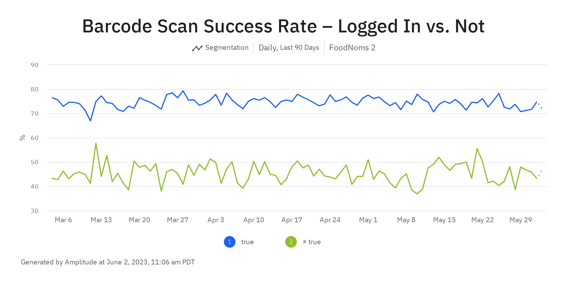
I've known for a long time that users that are signed into the community database are more likely to retain. In fact, signed in users are 38% more likely to come back one week later after they start to use the app. This isn't surprising, because a core part of the app, the barcode scanner, is way better if you're signed in. You're almost twice as likely to get a result from scanning a barcode if you're signed in versus if you're not.
Hypothesis
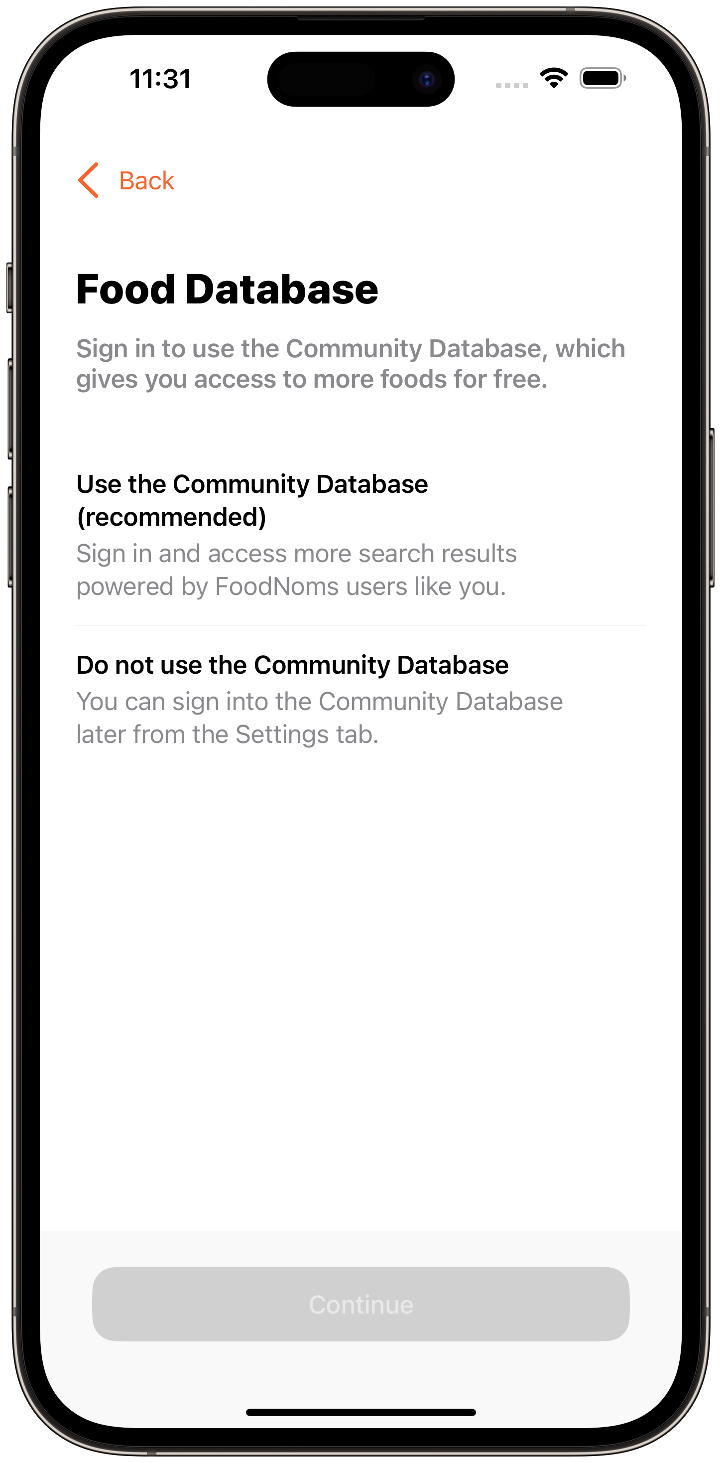
The onboarding flow is the critical point to get people to log into the community database. The current onboarding pane for logging into the community database is not optimized to drive users to sign in:
- It doesn't have a default. It's easier to not sign in than it is to sign in.
- The value you get from signing in isn't clear – "more foods" is ambiguous.
- The fact that this is free is not emphasized. It's possible some users may confuse this screen with some sort of paywall.
If we drive more users to sign in during the onboarding flow by tackling these identified weaknesses in the design, users will be more likely to activate (i.e. logging at least one food).
Metrics to Monitor
- Sign in rate
- Activation rate
- Long-term retention
- Rate of conversion to trial start or payment
External Factors & Other Experiments
- During the period of this test, the price of the FoodNoms+ subscription was fluctuating as I'm also doing some price testing.
- Since this test was run nonconcurrently, it's very likely that the two treatments saw different kinds of users with different propensities to activate. For example, users coming from different search ads campaigns and organic traffic sources.
Questions
- Will users be more likely to sign in? If so, by how much?
- Will activation be impacted? If so, by how much?
- Will this change cause an increase in users dropping off after they see this step?
- Will we see evidence this increase in activation actually translates into an increase in retained users?
Experimental Experience
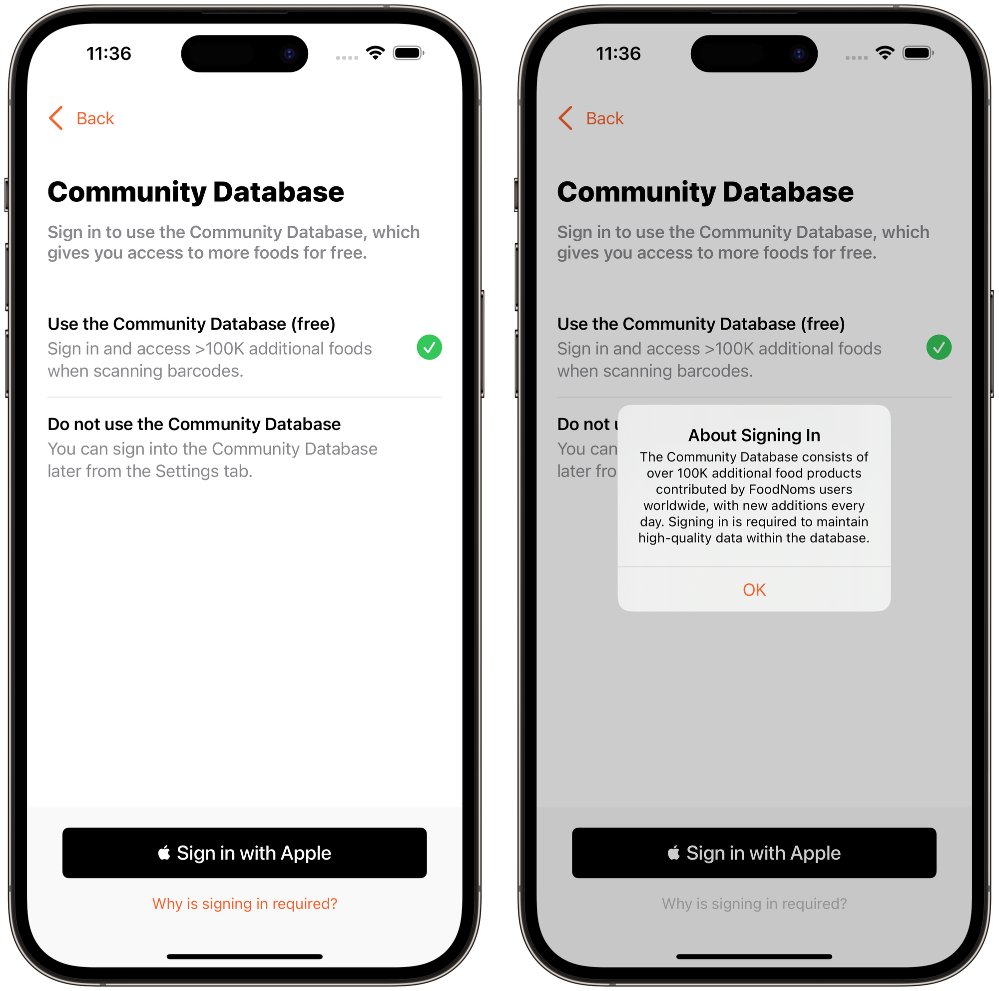
The new design makes the following changes:
- Makes the Community Database option the default selection. Users can still opt out with the same amount of taps, but the app is being more clear in what it wants you to select.
- Gives an explicit number: ">100K additional foods when scanning barcodes". Mentioning the barcode scanning is important, too, as that's a key feature people are looking for.
- Replaces "(recommended)" with "(free)" to emphasize this isn't a paywall.
- Adds a button for people that want to understand why they are being asked to sign in. This button will show an alert with a brief and honest explanation.
Answers
1. Will users be more likely to sign in? If so, by how much?
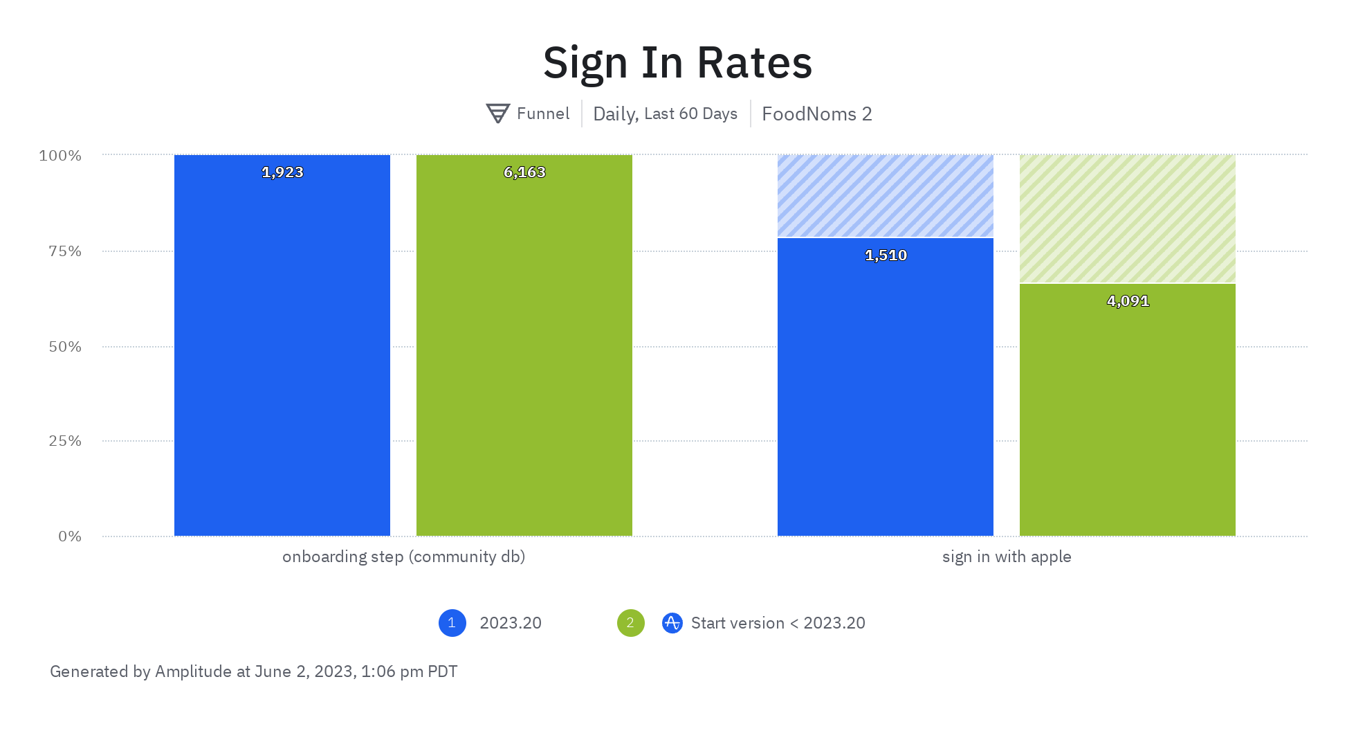
Yes! Users that saw this new design were a whopping 18% more likely to sign in than with the previous design. That's huge! These sorts of increases are quite rare, but certainly more common to find when you first start optimizing funnels like this.
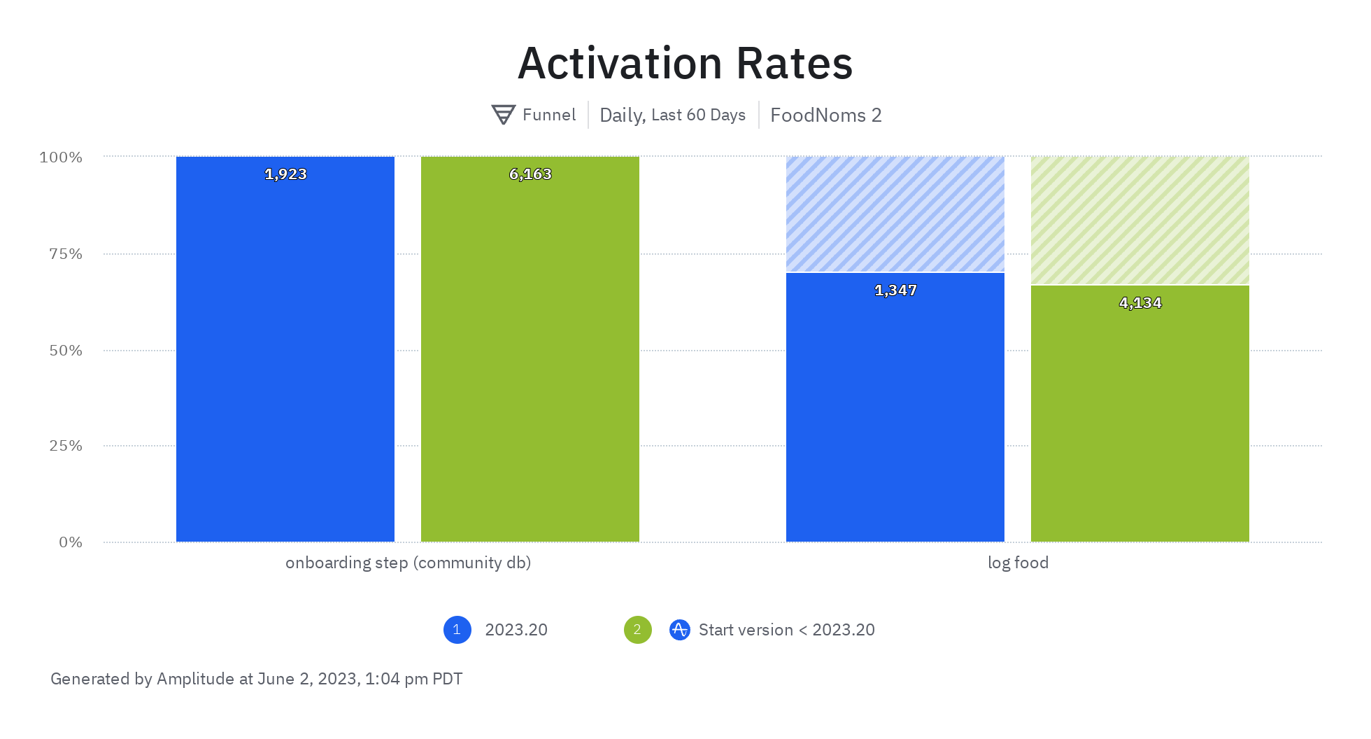
2. Will activation be impacted? If so, by how much?
Users that saw this new design were 4.6% more likely to activate than with the previous design. By the numbers, this result is statisticially significant. Although there were other variables that could have impacted this variable since the designs were not being tested simultaneously, I have confidence that this change is responsible for the increase in activation rate.
3. Will this change cause an increase in users dropping off after they see this step?
From the data I observe a -0.7% decrease in users making it to the next onboarding screen. This is totally fine because a) the decrease is not statistically significant and could very much be due to chance and b) the rate, however, is still a solid 97% – which is really fantastic.
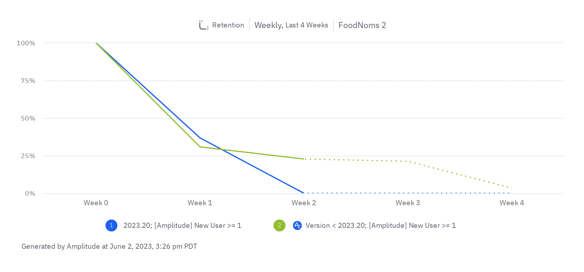
4. Will we see evidence this increase in activation actually translates into an increase in retained users?
It's really tough to say given the nature of how this "test" was run and that it's only been a few weeks since the new design shipped. However, it seems that there is a possibility that yes, this change has helped increase week 1 retention for new, activated users. At least for the first week of data, there was a 19% improvement in week 1 retention.
Learnings
- Defaults matter. My hunch is having the default selection be to use the Community Database makes it so much clearer what the "right" choice is.
- Concrete language is much more persuasive. "100K+ more food results when scanning barcodes" is way more impactful and tangible than simply "more foods".
- Confront user doubt and questions head-on. I observed firsthand that users were skeptical of this screen. By acknowledging that and answering their questions of "why is this required" is going to make some people feel confident that it's the right choice for them.
- Emphasize "free" when possible and relevant, especially when it may seem ambiguous.
- This project had massive ROI. The design and engineering changes didn't take but 30-60 minutes or so. I should prioritize spending more time on similar projects.
Note, I can't fully adopt these learnings as the "truth". It's possible that one of these is not true, and it was really the other changes in the design that drove the ultimate outcome. Future tests should apply these same learnings and over time, a more complete understanding will develop.
Next Steps
- Roll forward (done).
- Experiment down-funnel. Since we have evidence that a) this is a valuable metric to move and b) it can be moved, we can potentially convert more users later who weren't immediately convinced in the onboarding. Today, there's a CTA to sign in from the "Log Food" screen. Consider starting an experiment that applies these learnings to its design and copy. Also, consider other points where we can promote signing in, e.g. when the users is scanning a barcode and no results show up. If the results didn't show up because the user isn't signed in, tell them that instead of showing the nutrition label scanner.
- Long-term: experiment moving the Sign in with Apple button to earlier in the onboarding flow and make it feel less like an optional step.
- Consider instrumenting the "Why is signing in required?" button to see how many users are actually tapping that, and see if the copy is motivating users or not.
Do you have some ideas for me for next steps? Or do you have some other feedback? Don't hesitate to share (Mastodon).
I'm not likely to do these sort of public retrospectives often, but perhaps every now and then. If you made it this far, I hope you enjoyed my writeup and found it at least somewhat insightful.